Hi! I’m Alfredo Román Jordán and I am analyzing a vast amount of data pertaining to the Covid-19 epidemic, but more specifically I am focusing on what clues human mobility (how much we as a society are moving around) can give us about the direction a future pandemic might go.
I am working in Dr. Johnsons lab, where there are 3 researchers, all individually researching a different factor that might have a correlation with the Covid-19 pandemic.
The Covid-19 pandemic has impacted all of our lives in one way or another, for me and a lot of my colleagues it has derailed two years of our education and social formation. When the pandemic came we had very few tools to actually predict what direction it was going to go, and a lot of our policy responses came weeks after predictable changes in the data. That’s why my research is consequential, I want to be able to create a real time model that can predict when we are entering a new ‘wave’ of a pandemic.
What is a wave and how do we find it?
I define a wave as a period of time in which cases of a pandemic are increased exponentially, like the ‘Omciron wave’. The difficulty that comes with finding waves within geospatial temporal data (in our cases over one thousand counties in the US) is that waves come at different times in different places. And what’s even harder to work with is that some places might experience waves that other places don’t experience or barely experience.
So, if that’s the case, how can we leverage machine learning find waves within our large dataset? (Covid cases per day, per county from 2020 to 2022) We have to code an algorithm that will determine that for us. I am still tinkering around with the parameters but the algorithm works like the following:
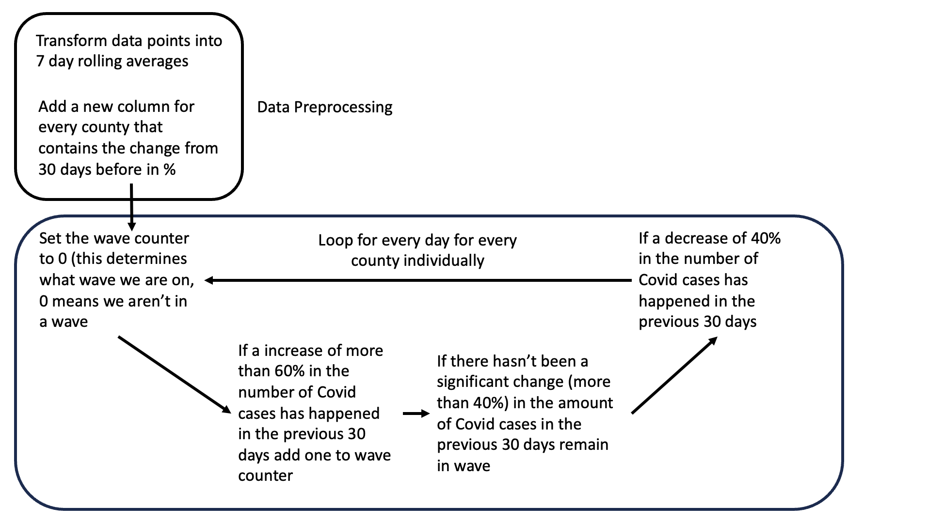
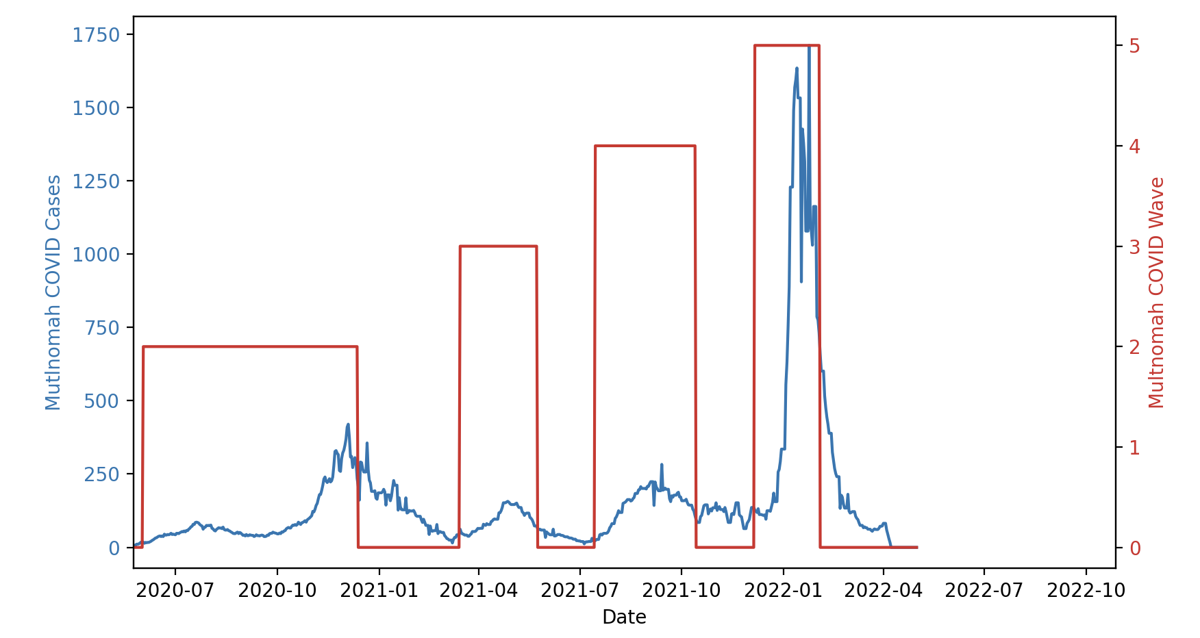
And at this point in my research the algorithm yields mixed results. Some counties with good data reporting like Multnomah County (Portland, OR) show really good results as evidenced in figure 2.
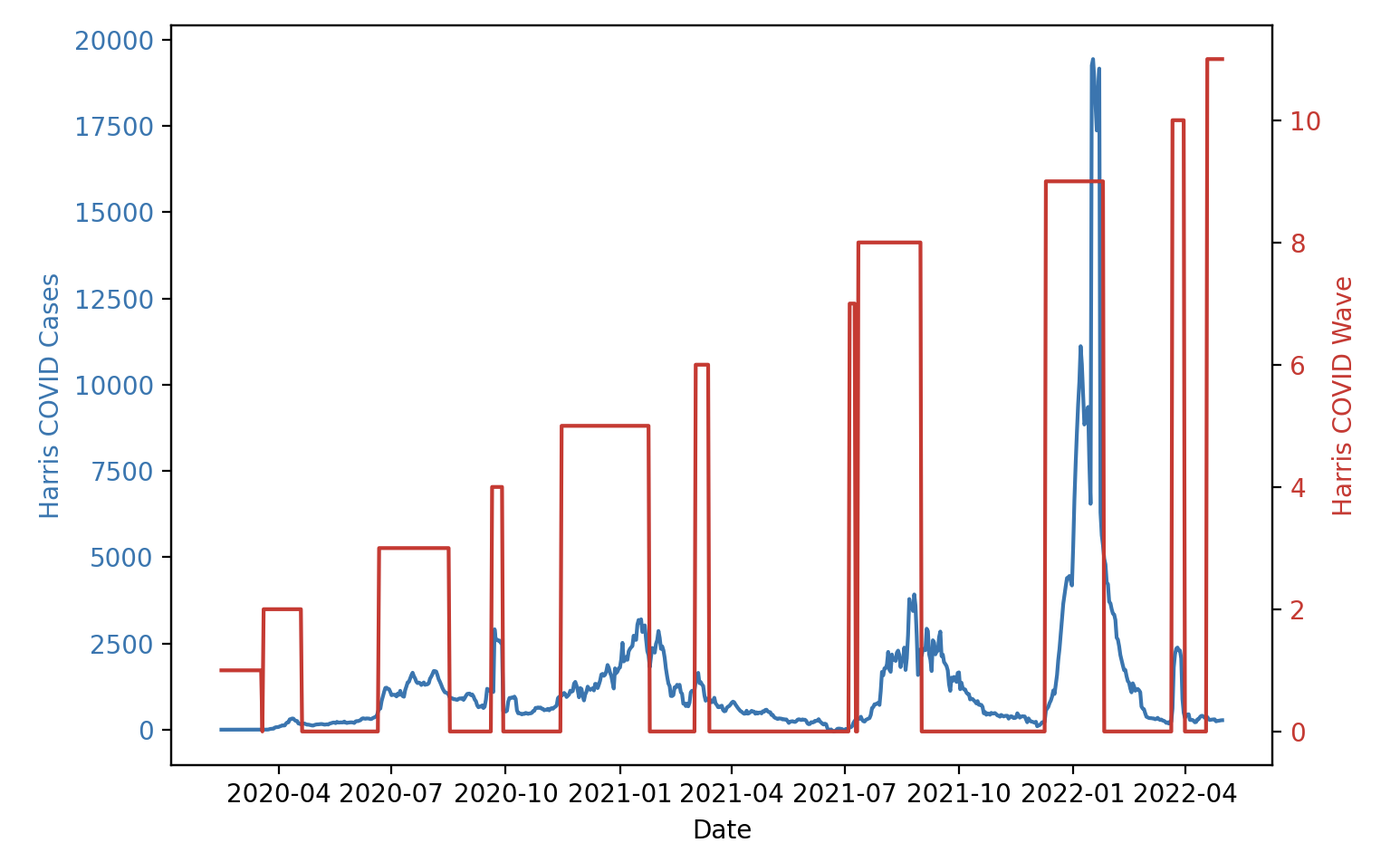
But other counties with inferior data reporting like Harris County (Houston, TX) show that the algorithm is overly sensitive to data anomalies and peaks that happen shortly before and shortly after major waves, as seen in figure 3.
This is evidence that I still need to work on the algorithm and tuning parameters. Going forward this will be my main goal, as all other framework is complete.
How do we predict waves or cases?
To make a prediction in data science you need two important things, your predictor (a.k.a.: the data you will use to make your prediction), and the data you are trying to predict. In our case our predictor is mobility and we are trying to predict waves.
But it’s not as simple as that. I have been referring to mobility as a straightforward thing when there are multiple different definitions for it. Initially I was using Spain as the area for my study instead of the US. This came with various advantages, more reliable state mandated data collection methods, and, more importantly, reliable mobility data using cellphone mobility as measured by cell antennas. This data measured, for every province, how many people travelled more than x km (depends per province, more sparsely populated ones have a higher number) as a percentage compared to the baseline from previous years.
https://www.google.com/covid19/mobility/ Accessed: 15/06/2023
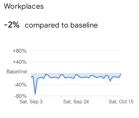
However this sort of data in the US is not public (and private providers for this data did not respond to my request for research use of their data), but there is public data supplied by Apple and Google. It is no secret that your phones track your every move (unless you have this setting disabled), so Google and Apple released datasets that for every county in the US tell us 5 things: compared to baseline from the beginning of 2020 how many people are going to transit stations, parks, pharmacies & groceries, workplaces and homes, for every day of the pandemic.
So for example data like in figure 4 (the latest data available, September 2022), tells us that at that time about 2% less people travelled to workplaces than did at the beginning of 2020, before the pandemic.
The Training Loop
What comes next is perhaps the most essential part of the data analysis. And it is what I call the training loop. The training loop tries to find a mathematical correlation between mobility and cases or waves.
The training loop iterates through various counties’ data. For each county, the code performs data preprocessing by cleaning up any missing values and ensuring that the dataset contains at least 60 days’ worth of data. This is crucial to avoid training the model on an insufficient amount of data.
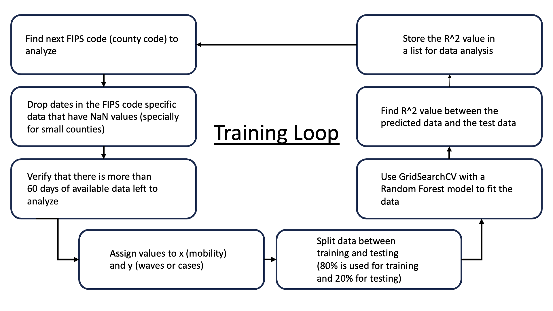
The data for each county consists of mobility data across various categories such as transit and parks, and the code aims to analyze how this mobility data correlates with the waves or cases in that county.
For the analysis, a Random Forest model is used. Random Forest is a popular ensemble learning method that is used for regression and classification tasks. It operates by constructing multiple decision trees during training and outputs the average prediction of the individual trees for regression tasks. This method is known for its high accuracy, ability to handle large data sets with higher dimensionality, and its ability to handle missing values. It also maintains good performance even when a large proportion of the data is missing.
To improve the accuracy of the Random Forest model, the code employs a technique called Grid Search Cross Validation (GridSearchCV). This technique is used to tune the hyperparameters of the model. Hyperparameters are parameters whose values are set before the learning process begins, and tuning them means finding the combination of hyperparameters that yields the most accurate model. GridSearchCV works by training the Random Forest model on the dataset multiple times, each time with a different combination of hyperparameters, and then selects the combination that performed the best. Cross-validation is performed to avoid overfitting. It involves dividing the dataset into ‘k’ parts, training the model on ‘k-1’ of these parts and validating on the remaining part, cycling through until each part has been used for validation.
Polynomial features are also created from the mobility data before fitting it to the model. This is done to check if adding complexity to the model (by considering not just the original features but also their higher-degree combinations) can help capture the relationship between mobility data and cases more effectively.
Once the model is trained with the optimal hyperparameters, it is used to predict the cases based on the test set. The performance of the model is evaluated using the R^2 score, which quantifies how well the predicted values match the actual values. The R^2 scores for each county are stored for further analysis.
Data Analysis
Once all of the R^2 scores have been calculated plots can be created. Firstly, using PloltlyExpress I generated a map of all processed counties and colored it in according to their R2 values.
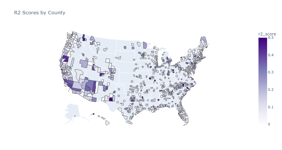
As can be seen in figure 6 the model was able to find a higher correlation in more metropolitan counties such as LA County in California with an R2 score of 0.39 or Spokane in Washington with an R2 score of 0.55. But it is also clear that there is still a lot of work to be done when it comes to tuning the wave definition algorithm.

In figure 7 you can also see that the larger counties exhibited better performance on average than the smaller counties. But the R2 scores are still not where I would like them to be (0.3 when comparing to similar studies).
This again is due to limitations with the wave defining algorithm.
Moving Forward
Moving forward I am going to fine tune the wave definition algorithm until a point where I get good results for most large counties. Focusing on large counties is the way to go because there simply is more, cleaner data with a higher correlation, thats why future models will only account for counties with populations larger than 250 thousand.
It is also important to note that I haven’t taken any third variable (like vaccinations) into account yet, this might improve the correlations I am finding.
Hacky Sack
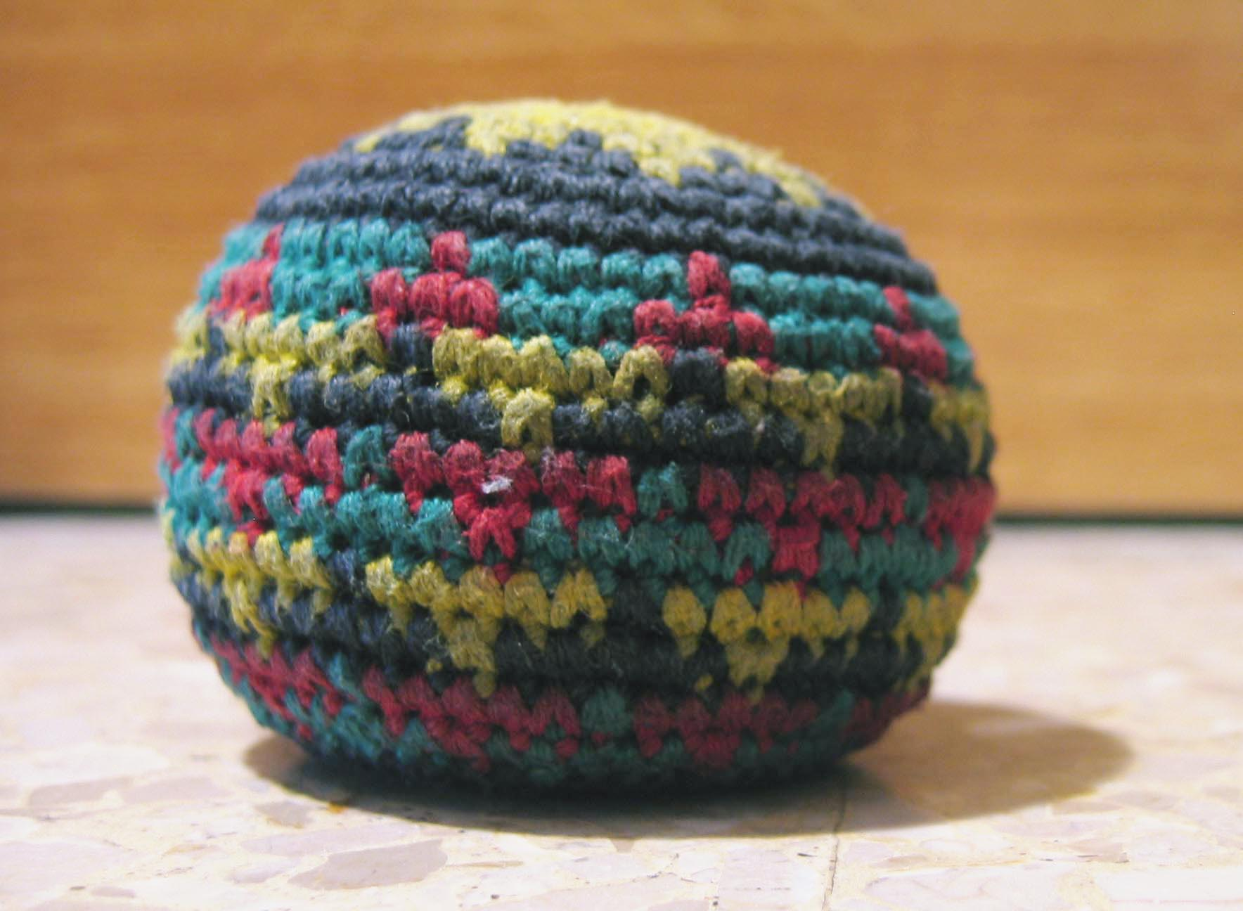
Every day our lab plays a game of Hacky Sack, a collaborative game in which a crocheted footbag like the the one pictured in figure 8 gets tossed around by everyone using everything but the hands. The objective of the game is for everyone to touch it at least once before it hits the ground, which is called a hack.
I think Hacking time is essential to my day to day, as it refreshes my mind from staring at a screen and has also developed close bonds between me and my colleagues.
